Pages

Wednesday, 29 January 2014

CONTENT PAGES ANALYSIS


This is a contents page of the magazine 'KERRANG!' and 'Q', one contents page is on one page and the other is on two pages, the first contents page contains multiple images, these images have been constructed by putting the main article with the largest image on the contents page, then it has images with page numbers and titles of where the article is placed and what it is going to be about. The second contents page also contains multiple images, the images have been constructed by putting the largest image as the main article, it had been place on the left side of the page.

For the 'KERRANG!' contents page, it has the colours of black, white and yellow and this supports the style of the front cover because the front cover has the same colour scheme. For the 'Q' contents page, it has the colours of red and white, which is opposite to the KERRANG! magazine contents page but not the white and this supports the style of the front cover because the front cover have the same colour scheme.

On the 'KERRANG!' contents page, it has a promotional feature but on the 'Q' contents page, there is not promotional feature. The logo on 'KERRANG!' is placed in the middle of the page and is on the masthead of the page, it is dominant because it is a different colour and font compared to any other word on the page. The logo on 'Q' is placed on the left page and is on the top left corner of the page, it is dominant because it is the largest letter on the page and is always placed on the top left of the left page.

On both magazine contents, there is no letter from the editor, in the 'KERRANG!' contents page, the language and style of writing adheres to the house style of the magazine because they keep the text short and simple, so the readers know what is on the page or pages and what it would look like. In the 'Q' contents page, the language and style of writing adheres to the house style of the magazine because they also keep the text short, even thought there are loads of writing, the keep it simple by giving a page and a summary of what will be on the page and for the main articles, they add an image and a page number. 'KERRANG!' contents page calls out to the audience by the colour scheme and the images included in the page and for 'Q' contents page, it calls out the audience by the images and the logo of the magazine.

CONTENTS PAGE ANALYSIS (GENRE)

The main image is the only image in the magazine contents page because it is the largest image on the page and there is only one image, on the right of the contents page, there are page numbers with a summary of what the page will be about, an example is one page 34 it is about albums and it says 'Guns N'Roses - no really - plus big ones form the The Killers and Kanye West'. This contents page is split into different sections, these sections are 'NEWS', 'RADAR', 'REVIEWS', 'LIVE!' and 'FEATURES'.

There is a promotional feature that is used in the contents page and they have made this very obvious because they have used the colour yellow to make it look important. The magazine logo is used as the masthead of the contents page and there is is a date but no issue number. Also, there is no letter from the editor and there is nothing about the editorial team.

NME magazine have the same layout for all their contents pages, the only difference is the text of the, the images of the contents page and at times, there is a promotional feature, if there is not a promotional feature, the magazine might of used the old promotional feature.

The logo for the magazine contents is always the same and is always placed in the same place of the page, it shows dominance because the magazine logo is always at the top of all the news that they put into all of their magazines. This calls out to the audience because it keeps it simple for the audience to find what they are looking for on the right side of the page, their main article has the main picture on it and has the promotion feature at the bottom of the page.

DOUBLE PAGE SPREAD DRAFT


PHOTOGRAPHY CASE STUDY


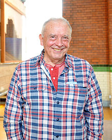
David Bailey at East End exhibition opening.jpg


David Royston Bailey, born on 2 January 1938, is an English photographer, he became a photographic assistant at the John French studio, then photographer for John Cole's Studio Five before being contracted as a fashion photographer for British Vogue magazine in the 1960's. In the year 2012, the BBC made a film of the story oh his 1962 New York photoshoot.

In 1959, David Bailey became a photographic assistant at the John French studio and in May 1960, he was a photographer for John Cole's Studio Five before being contracted as a fashion photographer for British Vogue magazine later that year.

David Bailey takes a keen interest in art, an exhibition of his paintings and mixed media works was held at London's Scream, which was opened in October 2011, it presents portraits and paintings inspired by his childhood, influences, inspiration, fears and desires.

This is a photo that is one of Bailey's famous, this is an image that Bailey took of the London Gangsters of the brothers Ronnie and Reggie Kray.
This one of David Bailey's latest portrait, this is one of Kate Moss and will be exhibited at the National Portrait Gallery, this is titled 'Bailey's Stardust'.
Kate Moss by David Bailey
The reason I have chosen David Bailey as my photographer inspiration is because for my Double Page Spread, i would like to use black and white as my colour theme for my image because to me it shows the emotion of the person and how they contrast themselves to society and everyone else.

Wednesday, 11 December 2013

MUSIC GENRE REARCH

Rock music is a genre of popular music that was originated as 'Rock and Roll' in United States in the 1950's and developed into a different range of styles in the 1960's in the UK and US. Rock music influenced a number of sub genres, these are:
- Garage rock
- Pop rock
- Blues rock
- Folk rock
- Jazz rock
- Christian rock
- Punk rock
- Indie rock
- Rap rock
and much more.
Key artist/bands that have a big profile in the Rock music genre are the Foo Fighters, Linkin Park, Paramore. This is because these bands are currently making new singles and albums.
Foo Fighters 2007.jpg


This is Foo Fighters performing on stage in November 2007, but they are continuing their tours with their songs.
Paramore 8-16-2010-2011-29-11.jpg


This is Paramore performing in 2010 and these are all the band members, from left to right: Jeremy Davis, Haley Williams and Taylor York.


'KERRANG!' is one of the most common magazine that covers the genre Rock music, they have many competitors, for example, 'Classic Rock', this is a magazine about the latest news on bands that were as famous as the bands in the 21st century. Kerrang covers the sub genre of heavy metal and classic rock is a British magazine covers the sub genre of classic rock.

Planet Rock Logo.jpgCross media for the genre rock is a radio station that is called 'Planet Rock', they are a radio station that covers the latest news on bands and other rock related stuff, they also sell tickets for concerts of well known bands, they have a 'playlist search' to find out what the music single or album they have recently played on their station, where they can either download or purchase their album and finally have a section where people can purchase merchandise.

Thursday, 28 November 2013

MUSIC MAGAZINE CASE STUDY

MOOD BOARD - ROCK MUSIC

This is a mood board that is related to the genre of Rock, on this mood board there is many images that is connected to the genre, there is images of rock bands, for example, Three Days Grace, Thousand Foot Krutch and You Me At Six. There are also images of the main music magazines that have people from rock bands, on KERRANG! there is Haley Williams from the band Paramore and on Rolling Stones there is Dave Grohl from the band Foo Fighters. Finally there is a poser with the words 'KEEP CALM AND LISTEN TO ROCK MUSIC' , a guitar pick with the work 'Rock' and as the background, it is a guitar that is on 'fire'.